
Desk Reservation Service
Role
I was the solo designer leading this project. My main responsibilities include evaluating usability, drafting conceptual wireframe, delivering final handoff, helping create design assumption doc and research plan, leading the overall design process in a cross-functional team.
Team
1 product designer, 1 product manager, 1 product Lead, 1 UXR, 6 engineers
Duration
Q2 2022 - Q3 2022
Links
.png)
Project Summary
There was work that was left unfinished after the initial Reserve Desk MVP 1.0 that needed to be addressed to increase the usability. In addition, we wanted to add further highly-requested Check In/Out functionality to the managing desk reservations process. Integrating those changes into the new GUI system was also required.
The MVP 2.0 serves to help reduce the cognitive load of both main users and admin to boost efficiency in the hybrid workplace setting. It also better connected the physical flow and mental model of making, viewing and managing reservations.


The Problem of MVP 1.0
For Main User
We noticed a high usage but low completion rate of the “Reserve a desk” flow, and it turned out that users were hacking this “creating” flow in order to “view” their own and colleague’s desk reservations. It ended up with a mismatched experience and only partial functionality was provided because users were not able to cancel reservations in the creating flow.

For Admin
We heard from office admins that they are having a hard time tracking if colleagues will show up for their reserved desks and when they will leave the office to free up the reservations. It was even harder for the case that one desk reservation is split to multiple colleagues in a day. They couldn’t complete their works successfully and eventually impact main users as well.
.png)
The Goal
We want to solve both the main users and admin’s pain points by optimizing the user journey, reducing cognitive load and decreasing the learning curve in the whole desk reservation process from beginning to the end. We also need to match the UI/UX with the new GUI and Web App to provide consistency across multiple platforms. We will use CSAT (customer satisfaction) and conversion rate as the primary metrics.
Design Principle
-
Understanding every step of the physical & mental journey in the hybrid workplace system, building the bridge to connect them with digital flow in Jet app for an unified user experience.
-
Mobile-centered experience - considering if the design supports graceful social interactions and behaves well in touch screens with limited screen sizes.
.png)
The Solution
.png)

New check-in/out feature
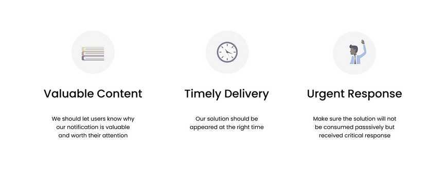
1. The challenge
Acting on notification is a naturally undesired behavior for main users. How might we make it intuitive without adding extraneous tasks?
🫤
We have multiple customers having various Check in/out policies and the major difference is the time frame. How might we make this time-sensitive feature universal and scalable?
🕐
2. The formats
I conducted a format audit and research to explore what & where & when users are shown check in/out function, and the pros/cons for different use cases.

3. UX flow
It indicated when the system & user action and decision would appear, and how many interactions users need to take to finish the task, which are important for prioritizing features.

4. User research
The goal of this user research was to collect user feedback and usability metrics for Check In functionality on Jet Mobile.

5. Key solution elements
.png)
6. Final design
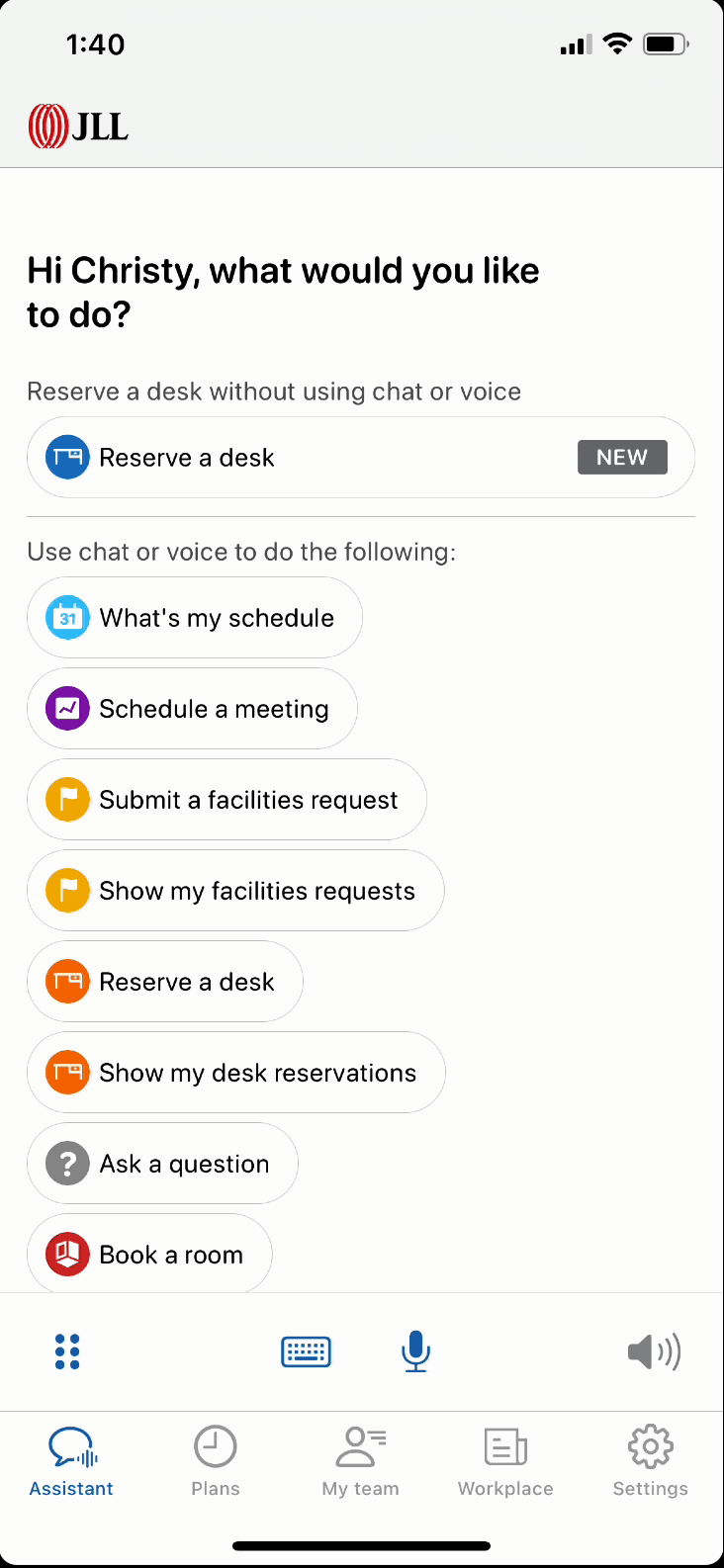
System notifications combined with three in-app features
In-app notification check in - High Discoverability
-
Use case: Within the check in window & having the app open (any tabs)
-
Principle: We show this bottom sheet only on root screens of five main tabs to decrease the interruptions and implementation efforts. Status in the card will be synced after sheet closed and finishing loading.
-
Use case: Within or outside the check in window & having the app open (Plans tab)
-
Principle: Countdown Timer should follow the building policy. Showing days/hours/minutes, but no seconds. We will make the whole row except “Check in” button tappable to open reservation detail screen.
Inline check in - Medium Discoverability
.png)
Check in button under detail screen - Low Discoverability
-
Use case: Within or outside the check in window & having the app open (Plans tab)
-
Principle: Having it in both expanded and collapsed view of the bottom sheet.
.png)


New viewing and managing reservation experience
1. UX flow
I lead co-creation workshops with UX flow and sitemap to explore the t-shirt sizings for different approaches with the team in the early stage. Along with UX research, we landed on a final flow before moving to specific reservation detail screen design.
2. UI Enhancement
The current color legend of map pins requires a higher learning curve and inconsistent with what we have on Desktop. It results in cognition issues for users and negative impact on Jet overall branding.
.png)
Open Question
What is the specific info users want to see immediately when they land on the reservation detail screen?
Do they firstly want to see where the reservations are located? 📍
Do they firstly want to see a list of information including schedules, amenities, etc? 📄
.png)
3. The final design
We made the decision to go with the "Show floor plan first" route. From interviewing the existing customers, it turned out that the majority of the time they have the same daily schedule in a week and care less about the amenities, instead they do really want to see who is sitting next to them for collaboration and social distance purpose.
However, too many interactions and taps were the issue with this approach and custom component was descoped due to implementation efforts. For the final design, I iterated on the navigation by adding the bottom nav bar in the third level to make sure the accessibility of top-level destinations and using full screen bottom sheet for an intuitive and standardized user experience.
.png)
Results
This desk reservation redesign provided a cohensive experience between digital and physical world. It reduced cognitive load and provided multiple choices for various hybrid workplace policies, but still gave users the freedom to eliminate unwanted information when needed.


Learning
How to collaborate with the eng team that want to be highly involved in every stage of the process?
1. Me and the eng lead worked on a design assumption doc together to document assumptions we made and the design was created based on that. It provided transparency that ensured everyone all on the same page.
2. We also established a very efficient and insightful "retrospective meeting" followed by every sprint with inputs from everyone and clear action items.
3. I noticed using video to deliver interaction ideas was much more efficient than wireframe or written/verbal description.
Icon or no icon?
Icons are mainly used for communicating common visual language and providing functionality. At the same time, icons can increase visual clutter if we use it too much or too often. So we should think of the principles we want to follow for Jet, which is clarity and simplicity instead of a decorative fun design. Therefore, if the label itself can deliver the information efficiently, icons are not needed here.
Native or custom design?
It was easy to come up with many innovative ideas that are visually appealing and functioning well. However, these approaches usually need custom work which would for example take 3-4 weeks for a small component from planning, implementation, testing and fixing. It also come with potential issues and bugs. When the time frame is tight, I learned to carefully review the inputs/outputs, digging into the native (HIG/ MUI) design to find out if there is anything we can leverage, and come up with the realistic solution.