
In-office Collaboration
Role
As the main designer leading this project, I was responsible for ideating and consolidating ideas, leading weekly design review meetings, helping create the roadmap, scoping out the actual project, and preparing handoff documents for the eng team.
Team
2 product designers, 1 product manager, 1 UXR, 6 engineers, and leads from Marketing and Product Ops.
Duration
Q4 2021 - Q2 2022
Links
.png)
Project Summary
“Knowing when teammates are going into the office is definitely a big pain point. Space is used much more for collaboration, so knowing who’s in on a certain day is important to us.”
-- A mid-market SVP of Operations
As organizations continue to adopt a hybrid workplace many find it hard for office workers to find times to be in the building and collaborate in-person. Teammates have a diversity and/or a misalignment of in-office plans it takes more effort than before to come together.
And while online collaboration tools have been able to help remote workers remain productive it still isn’t as productive and personal as physically being in the same room together.
Jet team launched the In-office collaboration feature - Plans and My Team - in both iOS and Android to make it easier for teammates to coordinate and connect in the office.
.png)
The Problem
The old Onsite Schedule feature was buried under the Workplace tab. It also lacks of the functionality to let users to see the onsite schedule of multiple selected colleagues at a time . We've heard from users complaining they were trying to utilize multiple existing features in the app to achieve this goal.
This fractional experience couldn’t fulfill customer's immediate needs. They'll find other solutions and Jet will lose out on opportunities.
.png)
Product Problem
The app was mainly focused on the CUI (Conversation User Interface) experience but had multiple issues reported from customers and product team.
.png)
The Goals
Business Goal
We want to increase the product stickiness and usage of existing paying customers. At the same time bringing more buyers and revenue by offering easy-to-use functionalities based on their recurrent theme of interest in this hybrid work environment.
User Goal
We want to save users' efforts from needing to look up each individual teammate one by one, and enable them to see where “their team” is working from so they could plan collaborations/meetings with those in mind.
Key Solution Elements
.png)
The Solution
New System

Visibility, people, plan and collaboration are the four key points to ensure a streamlined in-office collaboration experience.

Visibility
-
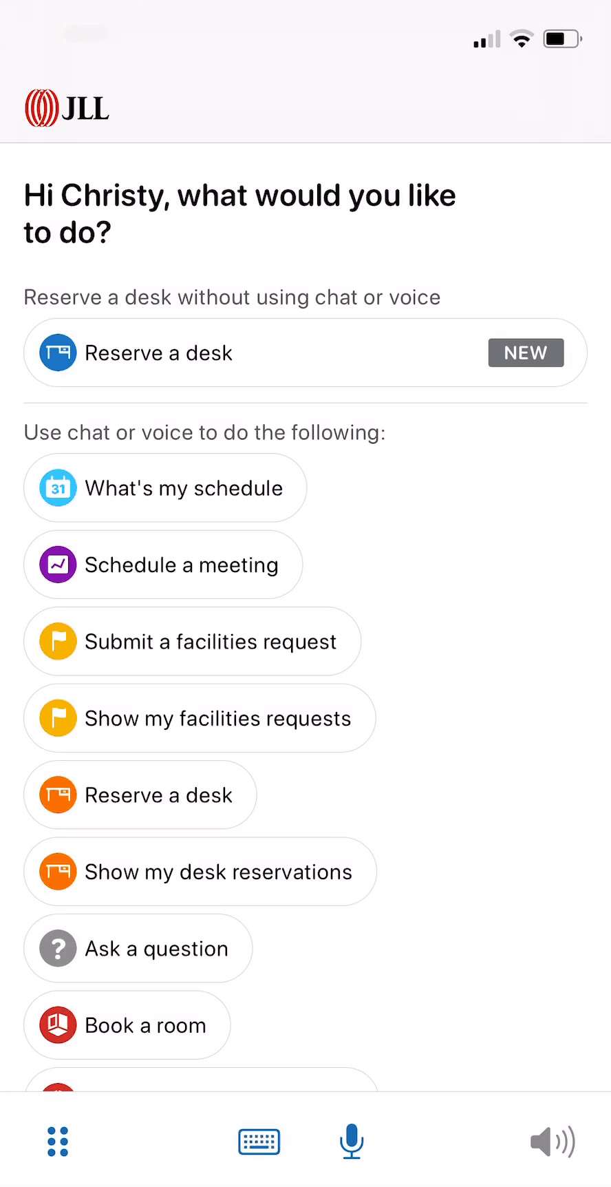
Replace CUI focused bottom navigation with tabs for Assistant (CUI), Plans, My team, Workplace and Settings
-
CUI is only accessible from the the Assistant navigation
-
New bottom navigation must be at bottom of screen while CUI bottom controls move above
-
Eliminate toggle to see the Bulletin view
-
Move Mute Icon from top navigation next to rest of CUI controls

We released this new bottom nav 2.0 to GA in April 2022 and received many positive feedbacks

People
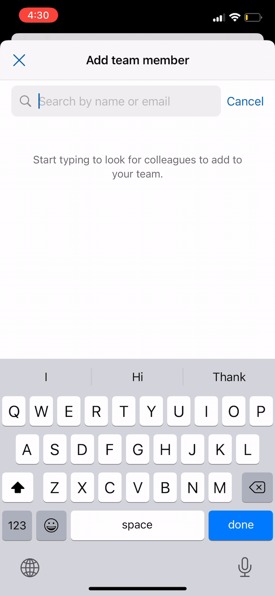
The My Team feature gives users a quick view into who’s currently at the office and where to find them by building, floor and desk. You can also quickly access colleague profiles for more info or to email, message or call them using a mobile device.
.png)
Zero content screen
Remove colleague from team
Onboarding screen
Manually searching for colleagues to add to team
My team list
Review colleague profile

Plans
The Schedules feature allows users easily see when others will be in and see how busy the workplace will be. If they see multiple team members planning to be in, they can simply add it to their schedule or duplicate a colleague’s schedule.
.png)
Onboarding screen
Set recurring plan
Zero content screen
Set in-office plan
.png)
Manage colleagues' plan (MVP 2.0)
Plan in the past
Current plan
Plan detail screen
View/Manage your own plan
Open Question
Should we decouple or couple "In-office Plans" with "Desk / Room Reservations" ?
What if users go to office just for a quick meet up without any space-related reservations?
What if user reserves a desk just for 2 hours and will be floating in office the rest of the day?
What can we provide for customers who have assigned desks?
...
The decision
After discussing with product team and talking to customers, we decided to decouple "Plans" and "Reservations" in order to cover more use cases and decrease the learning curve of new features.
-
Users can reserve, view and manage desks/rooms under the Plans tab
-
The flow of creating reservation is separated from setting an in-office plan
-
We should differentiate recurring vs nonrecurring, single vs multiple, own plans vs colleague's plan, etc.

Connections
The ultimate goal is to ensure employee's connection and collaboration, improve overall productivity and morale and that it’s best done in-person at the office.

Screen recording from current Jet app
Results and Impact
We launched this new In-office Collaboration experience to GA in June 2022.
iOS
Android
Measure Success Rate
-
Product stickiness - usage (Avg. DAU/MAU) rose 11% by Q3 FY22
-
iOS app rating: 4.6 (previously 3.8)
-
12% increase of users going into the office
-
Survey indicates 77% will likely or very likely add an office plan
-
Survey indicates 87% will likely or very likely add colleagues
Learning
Consider the cost-benefit principle in all aspects of design throughout the process.
This new collaboration experience required a good amount of new features to be added into the app to make it work from creating, viewing and managing flow. Along with the system revamping (CUI -> GUI), it was really easy to get into a feature creep. As a product team, we constantly asked ourselves: “will the benefits provided by new features outweigh the costs of increased complexity”? On the other hand, I’ve noticed a fact that users didn’t really count how many clicks, swiping, features they encountered as long as the experience is streamlined and has a relatively low learning curve. Onboarding, educating, small visual hints are all helpful to guide user through the process. (We saw a significant uptick after implementing badges on the new bottom nav bar)
Me and our UXR conducted many rounds of testing in different design stages and pilot review meetings to validate concepts, test usability, and understand the value. Combined with the estimated implementation efforts from the dev team, we wanted to make sure we made the right decisions for both business and users.